4 SIMPLE A/B TESTS THAT WILL DOUBLE YOUR OPT-IN RATE
When it comes to site optimization…
Draw your own conclusions.
And back them up with DATA.
Here 5 things you should be A/B testing:
1. Triggers
A/B test trigger settings - events that need to happen in order to activate the appearance of your opt-in form:
This includes:
- Show on page load
- Show when the user reaches the end of the content
- Show when a user scrolls to a specific part of the content
- Show when the user scrolls to specific percentage down the content
- Show when a user clicks an element
- Show when the user is about to exit the page (exit intent)
- Show after a certain period of time

For example:
In the last 12 days I've found forms showing immediately on page load are converting better than 10 seconds after page load:
2. Display frequency
You’d think showing the same form to the same visitor every time they open a new page would piss them off, right?
Depends…
I consistently see higher opt-in rates setting extremely aggressive display frequencies:
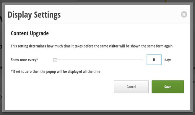
Forms are set to display all the time.
BUT, this might not be the case for you.
Test how much time needs to pass before a visitor will be shown the same form again.
3. Form types
All forms are NOT created equal.
On this blog…
Popups blow all the other form types out of the water.
For example:
This 2-step opt-in form (triggered when somone clicks the button in this post):

Converts at 2.17%:

Compared to the same offer in a popup form converting at 5.12%:

This may or may not be the case for your website, but you’ll never know if you don’t TEST it.
4. Form design/ messaging
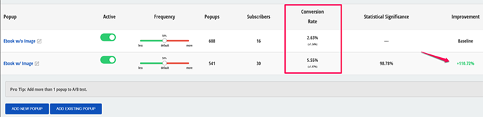
Do you think adding an image to your popup forms will boost the conversion rate?

Versus this one:

Adding an ebook image to the form increased the conversion rate 110.72%:
5. CTA
I’ve got good news and bad news.
Bad news:
Many readers are filling out your opt-in forms only to bail at the last second.
Good news:
It can often be fixed with some simple tweaks to your CTA button copy.
For example:
You may have noticed this CTA button copy on the blog:


Why do I choose not to use traditional button copy, like “submit”, “register”, “sign up” or “join”?
Three reasons:
- Words like “submit” make you feel like you’re giving in to something (submission!), whereas “Sign up” and “register” sounds like you're committing to something serious.
- Using copy like “I’m In!”, “Let’s Do This”, “Get Started” standout and make the reader feel like they will receive IMMEDIATE value.
- Every man and their dog is using this copy.
Instead of a neutral word, use catchy verbs and language reinforcing why the reader is signing up.
For example, if you are giving people a bonus, change the button so the visitor will “Get the bonus”.
Button colors
What do most people do when they see red?
They STOP…
Think…
And take action.
A strong contrasting color will act as a pattern interrupt and have a better chance of catching the eye of the reader.
Test a few different color variations and see if it bumps your conversion rate.