Test call-to-action buttons
You can easily boost your conversion rate by 13% or more, just by testing your call-to-action buttons. That alone can make a whole lot of difference to your overall client acquisition rate.
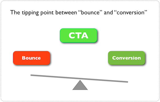
According to Unbounce, “the-call to-action represents a tipping point, between bounce and conversion.” In other words, if you don’t want your readers to exit your landing page, then pay attention to the shape, size and color of your call-to-action button.
There are different ways to create an A/B test for call-to-action buttons, but the objective is to determine the best color, size, shape and copy that will inspire more people to take the desired action.
Here are some examples of effective call-to-action buttons:
i). Square Register: Square is a point-of-sale payment solution used by many U.S. retailers. Their call-to-action button is white with a cyan background. The color for the text is blue.
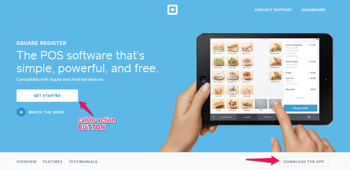
Takeaway: Test different button colors, but don’t use lots of different colors that will seem garish to readers. Split test, in order to determine the optimum size/color combination for your prospects and overall marketing strategy.
ii). GiftRocket: GiftRocket is an online gift merchant that uses a call-to-action strategy to engage users and inspire them to click.
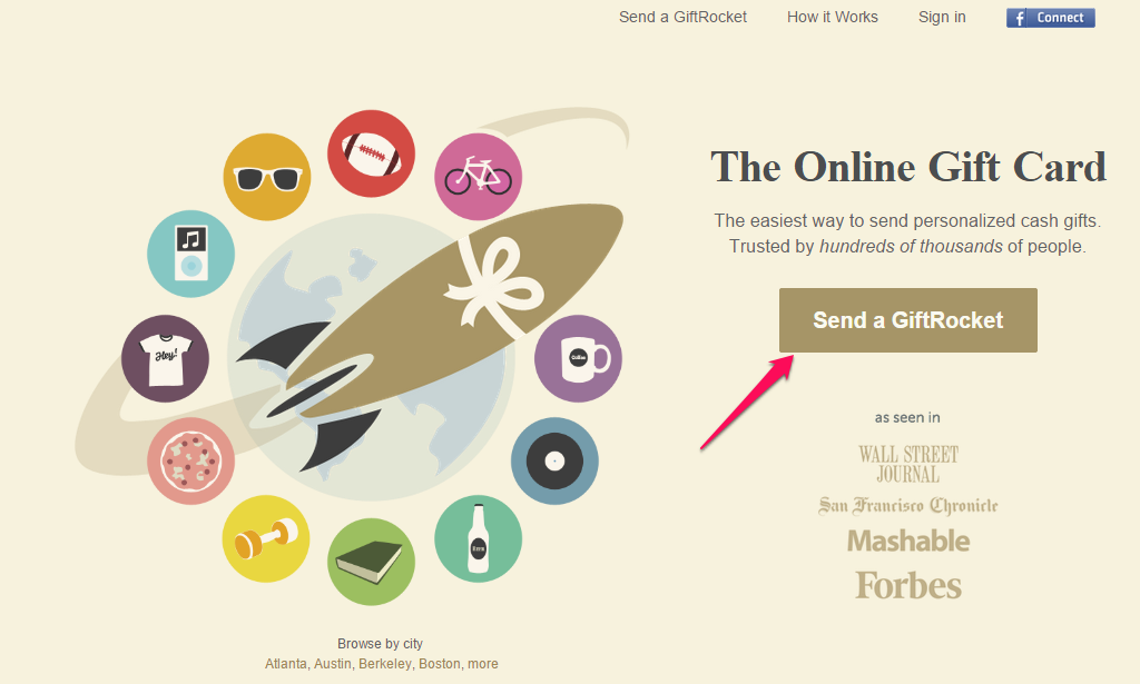
Takeaway: The call-to-action button doesn’t urge customers to “buy” or “subscribe” — instead, it nudges them to “Send a GiftRocket” to their loved ones.
The landing page copy also has a handful of strong verbs (action words) and is written in the active voice. And, the image on the left side further explains the “gifts.”
You can take a page from the GiftRocket “book” and appeal to customers and prospects (most of whom detest feeling “sold to”), by creating call-to-action copy that isn’t pushy
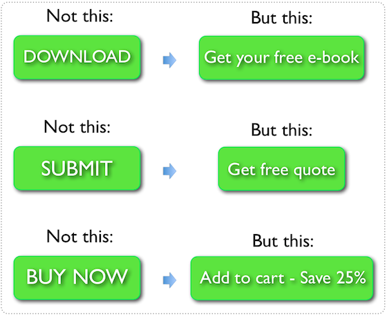
Here are some generic call-to-action buttons that you should avoid, as well as some great ideas for alternative copy:
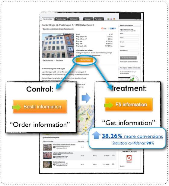
Small tweaks work wonders in call-to-action buttons. When Michael Aagaard split-tested “Order information” vs. “Get information” on a call-to-action button, the result surprised everyone: “Get information” increased the conversion rate by 38.26%.